DH110
DH110 Assignment 5: Low-Fidelity Prototype
Carlie Huang, Spring 2023
Introduction
My project for this quarter aims to eliminate inter-generational language barriers through an instant translation messaging app. It is difficult to feel or stay connected with family members that have different native languages— a hardship I’ve experienced myself. So far, I’ve:
- performed a heuristic evaluation to identify usability issues in similar/competing tools
- conducted a pilot usability test to corroborate my analysis with actual user input
- led user research to broaden my findings and apply them to my design
- constructed user personas and scenarios to step into the shoes of potential users.
A large goal of the project is to make the app accessible for people of all ages, especially because older populations are likely those experiencing language related difficulties and are generally less technically adept. A low-fidelity prototype will help me ensure that the app functionality and flow is easy to learn and intuitive. The prototype will also help me discover any issues or design flaws that I need to work on to improve user experience.
The two personas I constructed were Mei Liu and Natalie Garcia; Mei is an elderly parent of an immigrant that wants to connect with her grandchildren, while Natalie is a college student that wants to stay connected with family back home. Based on this, Mei must be able to figure out the basic functionality of the app, including setting up the account, adding a contact, and sending a message to a contact. On the other hand, this should be very simple for Natalie, but she might want to use the more advanced feature of viewing the original, untranslated text message in order to improve her Spanish.
Therefore, the three tasks that I’m aiming to implement in my prototype are:
- Account setup
- Add contact and send message
- View original text
Wireframes
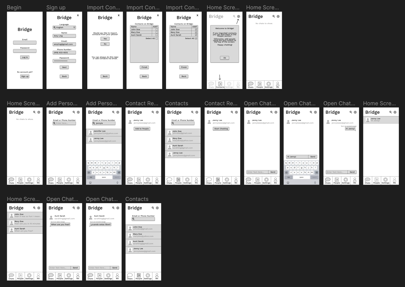
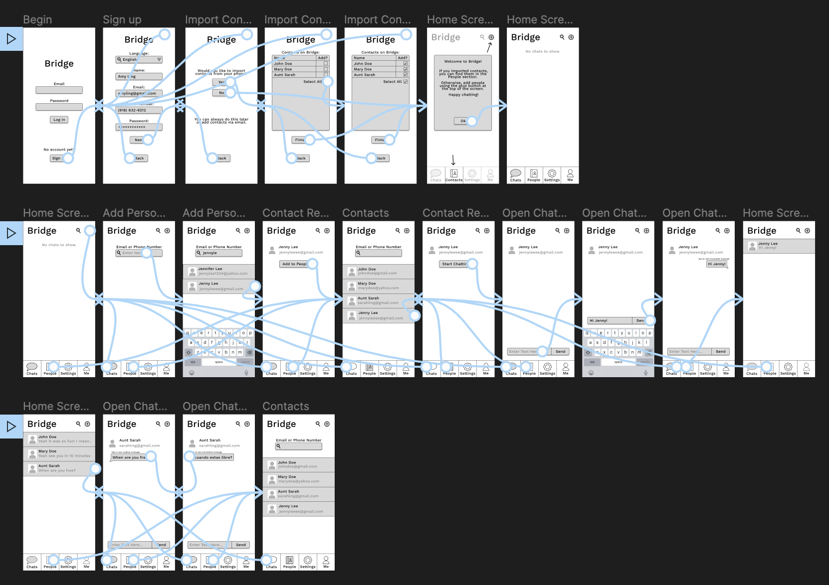
Wireflow
See it in detail on Figma (Prototype in Right Column)
User Testing
The video of the user completing the tasks and voicing their thoughts is here
Task 1: Account setup
The user was able to complete the task successfully, but they did notice some things I overlooked in my prototype. On the sign up page, I didn’t prototype the interface for actually selecting a language and/or entering the other necessary information. Also, the checkboxes when importing contacts were not functional, only the Select All checkbox worked.
Task 2: Add contact and send message
The user also completed this task successfully, but they pointed out some flaws. For one, the People section already showed the contact they were meant to add at the beginning of the task. Also, they explained that they expected to be able to start chatting right away after adding the contact rather than having to go through the People section.
Task 3: View original text
The user was also able to complete this last task successfully, and there were no confusions or unexpected interactions during this task.
Reflection
I enjoyed this assignment a lot; seeing my project really come to life and take shape was very exciting. Because I prototyped on Figma, the test was pretty easy to set up. I made all the wireframes, connected the wireflow, and labeled the flows with the appropriate task numbers. Then, I pulled up the interactive flow using the run arrow button on the top right of the design and I pulled up the description of the tasks in my note app. I used a Zoom meeting to record both the user’s flow and their thoughts.
From the first task, I definitely learned just how thorough and careful wireflows need to be. It is confusing for users when a feature they expect to work, like clicking on an input or checking a checkbox, does not do anything. Also, I don’t think the user even noticed the x in the upper right-hand corner that would take them out of the sign-up process, so I think I need to re-think how that is presented. Overall, there were a couple hiccups, but considering the user is in the demographic of Natalie, I’m not surprised that it went smoothly nonetheless. Mei, however, might struggle if these flaws were presented to her.
Based on the feedback from the second task, I would add the button “Start Chatting” to the result of the add contact search so that the user didn’t have to go through an extra step to start chatting with the contact they found, and the contact would still be added to People nonetheless. I agree that not having this button is confusing. Similarly to the first task, this extra hoop to jump through might not be a big deal for technically-adept Natalie, but could be very confusing for Mei.
The last task went very smoothly, and I did not receive any feedback on it. Therefore, there is nothing I learned or would change from it.