DH110
Bridge: Instant-Translation Messaging
Carlie Huang, DH110 Spring 2023
Introduction
This quarter in Digital Humanities 110, we aimed to build a project and design around the theme of family connection. One of the largest barriers I’ve faced in connecting with my family is not speaking a common native language. Thus, Bridge was born: an instant-translation messaging app that opens the door to inter-generational communication and connection. You send a message in your native language, they receive it in theirs. They send a message in their native language, you receive it in yours. It’s that simple.
Design Statement
As the child of an immigrant, I’ve struggled to communicate effectively with my parent, grandparents, and extended family all my life. I’ve tried multiple tools, such as Google Translate, to try to facilitate better communication, but nothing ever stuck: the solutions were too clunky and not a seamless experience for either party. I believe that through intuitive design and a focus on simplicity, Bridge can serve as an accessible platform that helps to connect family.
Competitor Analysis: Heuristic Evaluation and Usability Testing
We started the quarter off with competitor analysis in order to see current designs in action and determine any usability flaws and possible points of improvement.
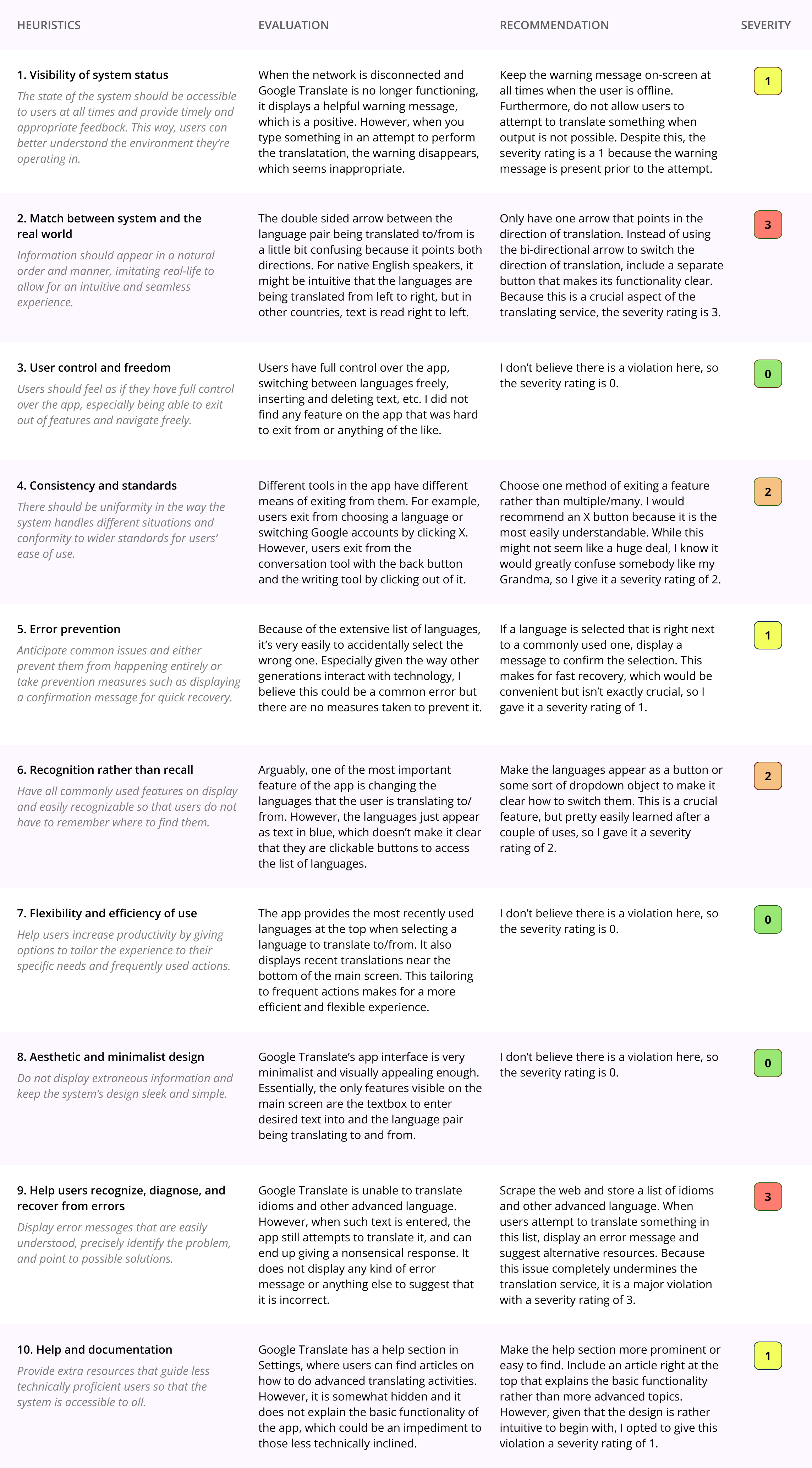
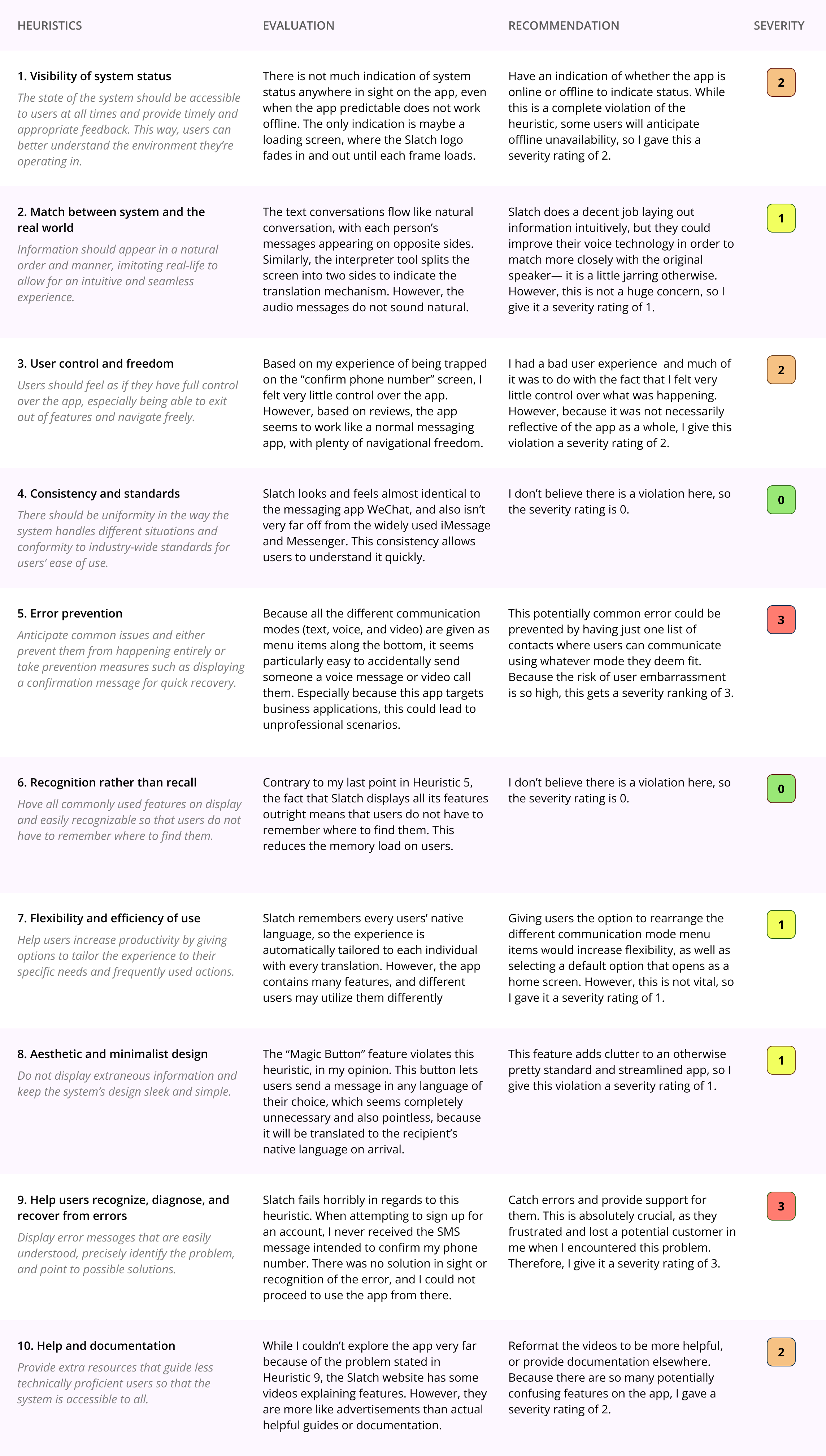
We first did a heuristic evaluation. I rated potential competitors Google Translate and Slatch on their adherence to Nielson’s 10 Heuristics. I evaluated both competitors on all the heuristics, gave recommendations on areas of improvement, and assigned a severity rating to indicate the urgency of the design issue.
Google Translate Heuristic Evaluation:
Slatch Heuristic Evaluation:
We then moved on to usability testing to substantiate the heuristic evaluations with real user experience. To do this, I prepared a Google Form Questionnaire with questions to gauge the perceived usability and tasks to gauage the actual experience of the competitors. I then asked a friend to participate in the usability test, and you can view the results below:
User Research
Next, we performed user research to understand the context in which a user would use the product. I used the research methods of contextual inquiry and participatory observation: I asked a potential user questions about their experience and then asked them to perform several tasks for my observation. I gained many interesting insights from the research, the most notable including a critique of current language translation models as inorganic and not considerate of regional differences.
The full transcript of the interview can be found here. The audio and video recordings of the different parts of the process can be found on the assignment page, linked in the section title.
UX Storytelling
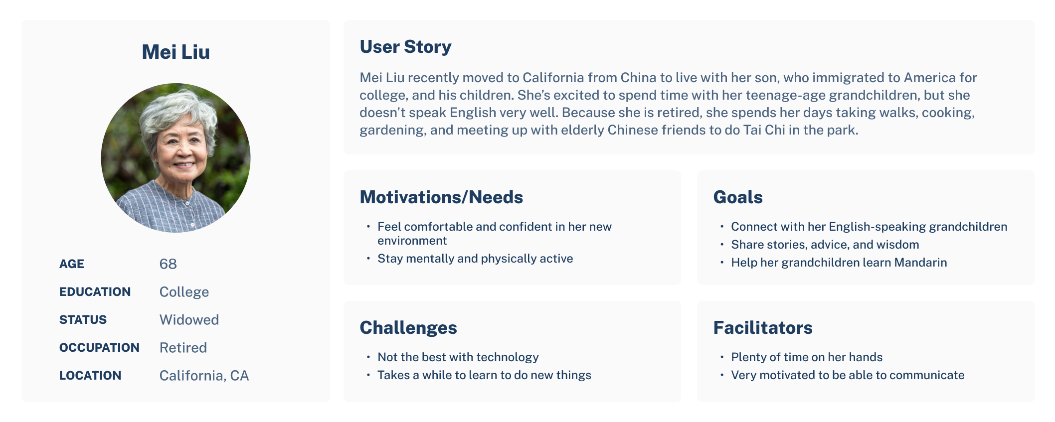
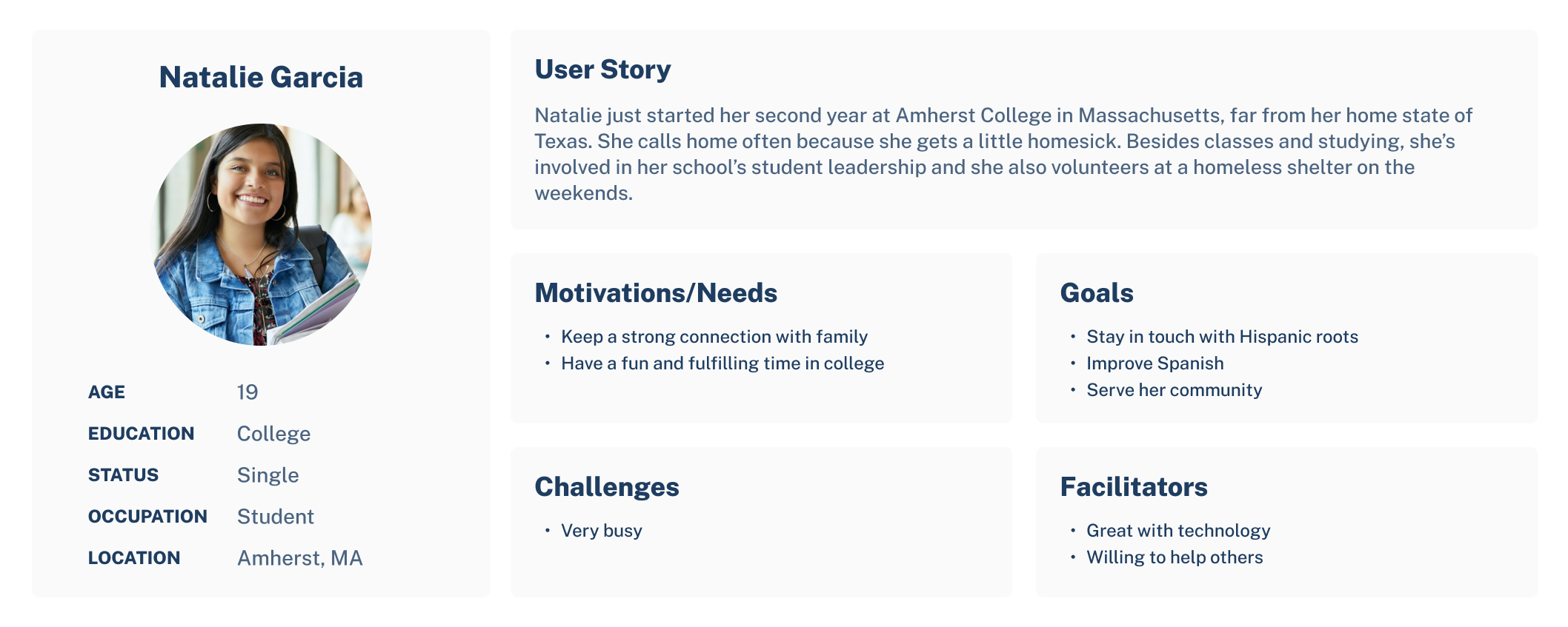
We then delved into UX Storytelling, which aims to put the designer in the shoes of the users in order to gain a deeper understanding of their needs, motivations, challenges, etc. Furthermore, it creates a unified vision of user segments that can help guide the design process so the end product is tailored towards real potential users. I ended up creating two personas, Mei Liu and Natalie Garcia, both with very different backgrounds, motivations, and day-to-day lives. Their personas can be seen below.
Wireframe and Graphic Variation
After gaining crucial foundational knowledge in the previous weeks, we put these insights to use and started creating the actual design. I put together wireframes, which can be seen in the next section, and then constructed an interface design on Figma. The purpose of this interface design is to develop a design library and produce a finished-looking, albeit static, product. For my work on the interface, I decided to use the chats frame because it pertains to the most important feature in the app— messaging— and essentially acts as a home screen. In the process of creating this design, I went through many variations, some of which can be seen below.
The original wireframe:
Typographic variations:
Final design system:
Low-fidelity Prototype
An overarching goal of Bridge is to make the app accessible for people of all ages, especially because older populations are likely those experiencing language related difficulties and are generally less technically adept. I built a low-fidelity prototype to help me ensure that the app functionality and flow is easy to learn and intuitive. The tasks accomplished by the prototype are:
- Account setup
- Add contact and send message
- View original text
I then connected the screens to make the prototype interactive; you can view the interactions here. Keep in mind, the prototype only implements what is necessary to complete the tasks listed above.
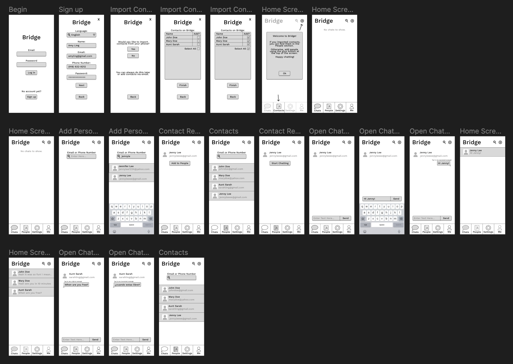
High-fidelity Prototype
Finally, I put all my work together in a high-fidelity prototype. This prototype accurately presents what the final look and feel of the product would be, and allows users to interact with it as a complete project. By incorporating rich visual design elements, accurate content, and interactive features, it enables designers, developers, and users to test and validate various aspects of the product, such as user interactions, usability, and aesthetics.
Evaluation/Revision History
We performed a cognitive walkthrough test to evaluate the usability of the high-fidelity prototype where users were asked about first impressions as well as any flaws or inconsistencies they found when trying to perform the tasks provided. The results and the feedback for my test can be found here. While I received mostly positive feedback, I did add a “Forgot Password?” link to the sign-in page because this was an oversight on my part and an important feature for any account system.
Pitch Video
Conclusion
This quarter-long project gave me in-depth exposure to all the steps required in a UX design process and their importance. I started with competitor analysis, evaluating Google Translate and Slatch based on usability heuristics. Usability testing provided real user feedback on these competitors. User research, including contextual inquiry and participatory observation, revealed insights into user needs. UX storytelling helped me create personas and understand user motivations. Wireframing and graphic variations led to a final design system. I created low-fidelity and high-fidelity prototypes to test functionality and aesthetics. I not only learned how to do all of this, I also learned through doing it. I learned the importance of not being overly attached to the product when conducting testing, the importance of thinking like a user, the importance of consistency and other design principles, and many other lessons I will take with me beyond this class.